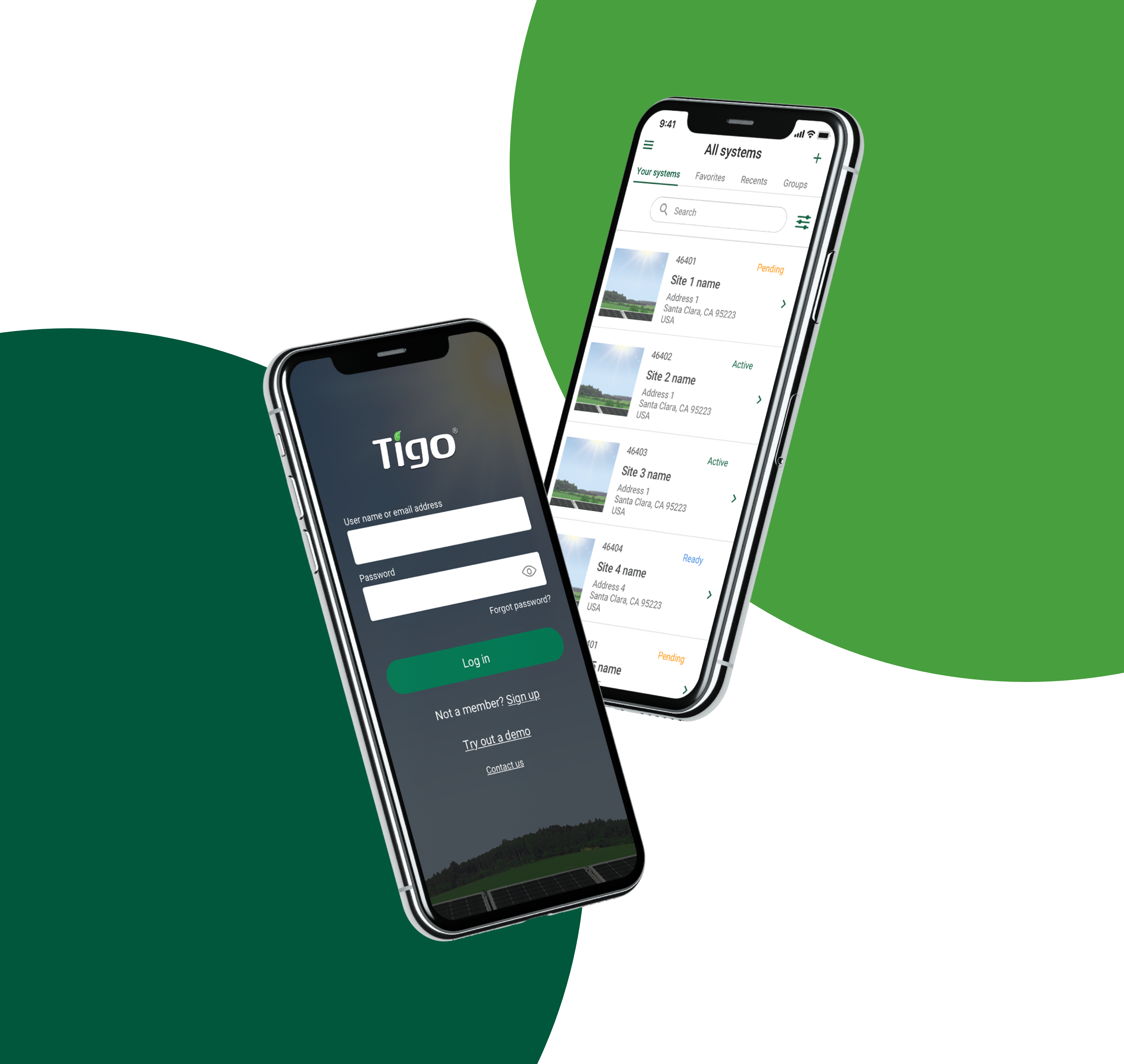
Bring the full energy picture into the mobile app.
The existing app covered much of the web product’s core functionality, but focused on DC data from solar modules. New inverter partnerships made AC data available, creating a need to show owners and technicians how their systems performed while away from a desktop.
As the sole UX designer, I collaborated with Product, Engineering, Marketing, and Support. This work followed the web dashboard redesign, with the same tight partnership-driven deadlines.
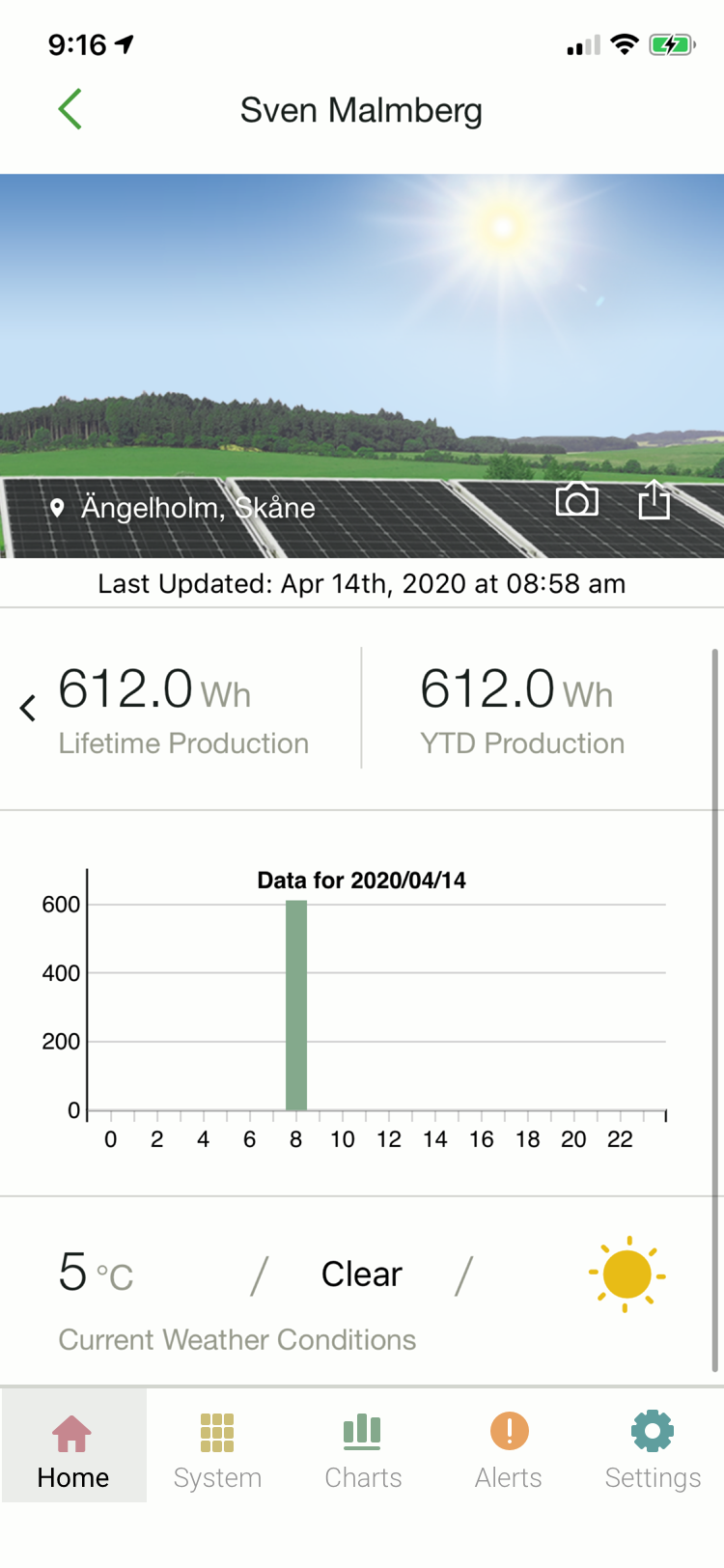
Owners wanted to understand generation and the return on their investment. Installers needed to check performance and troubleshoot. Conversations with Support reinforced that technical experience varied, so the interface needed to explain the data clearly.
Let people compare the signals that matter.
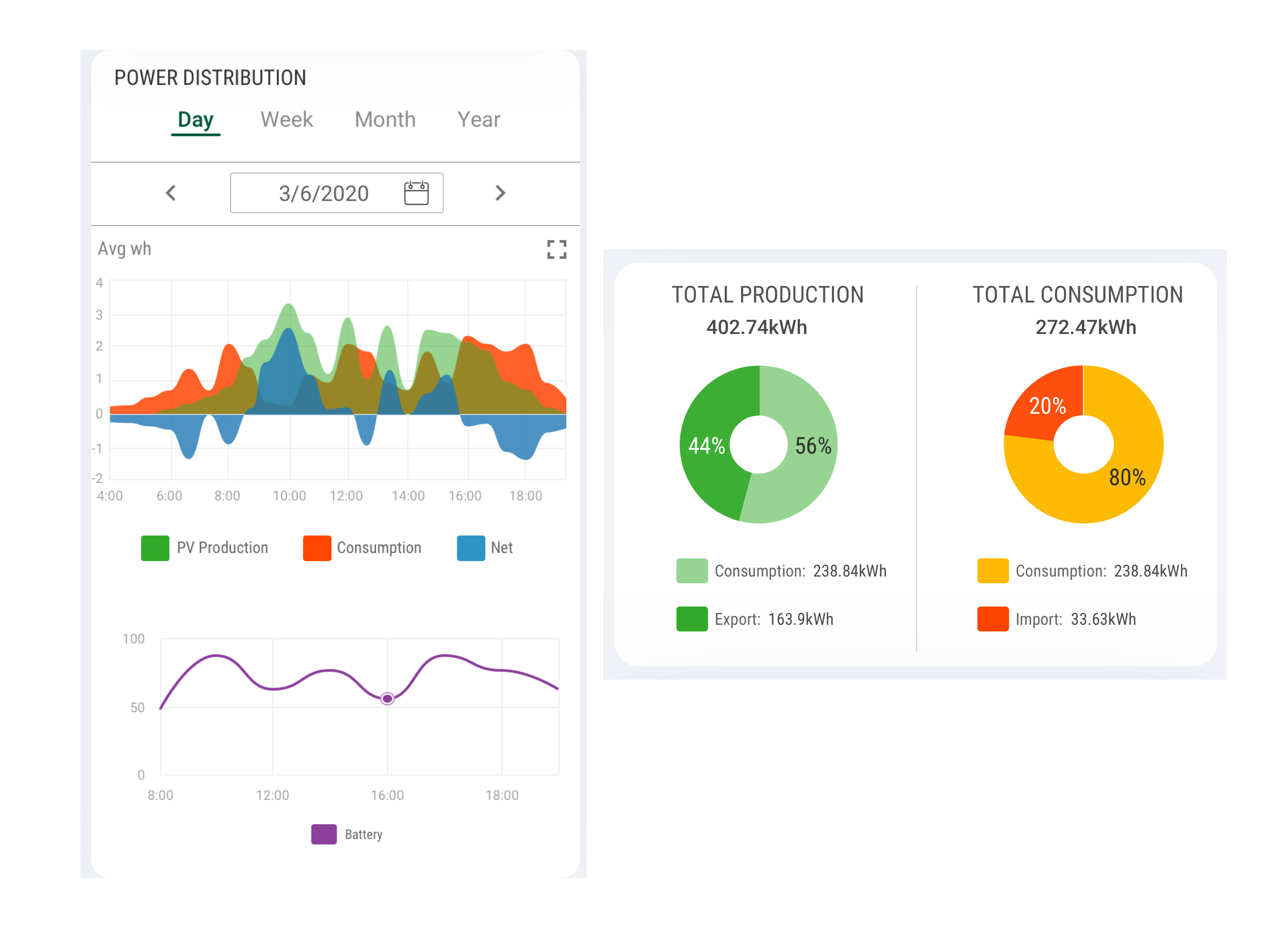
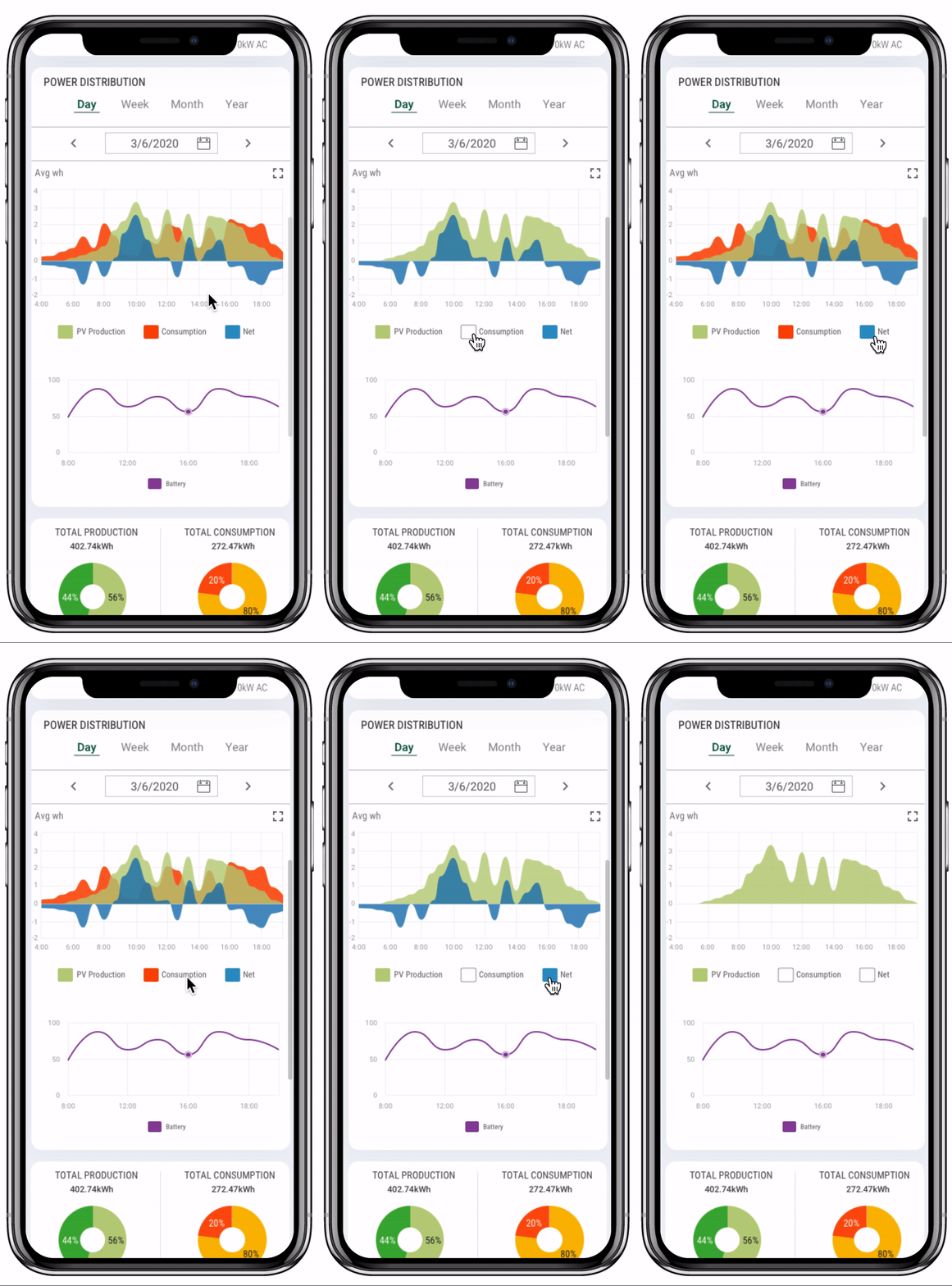
I used an area chart to display AC performance, with individual variables that users could toggle on and off. This let them control which signals they compared on a small screen.
Two donut charts summarized total production and consumption, showing how much energy was exported to or imported from the grid. The breakdown connected system performance to the energy people actually used.
Make system alerts available on the go.
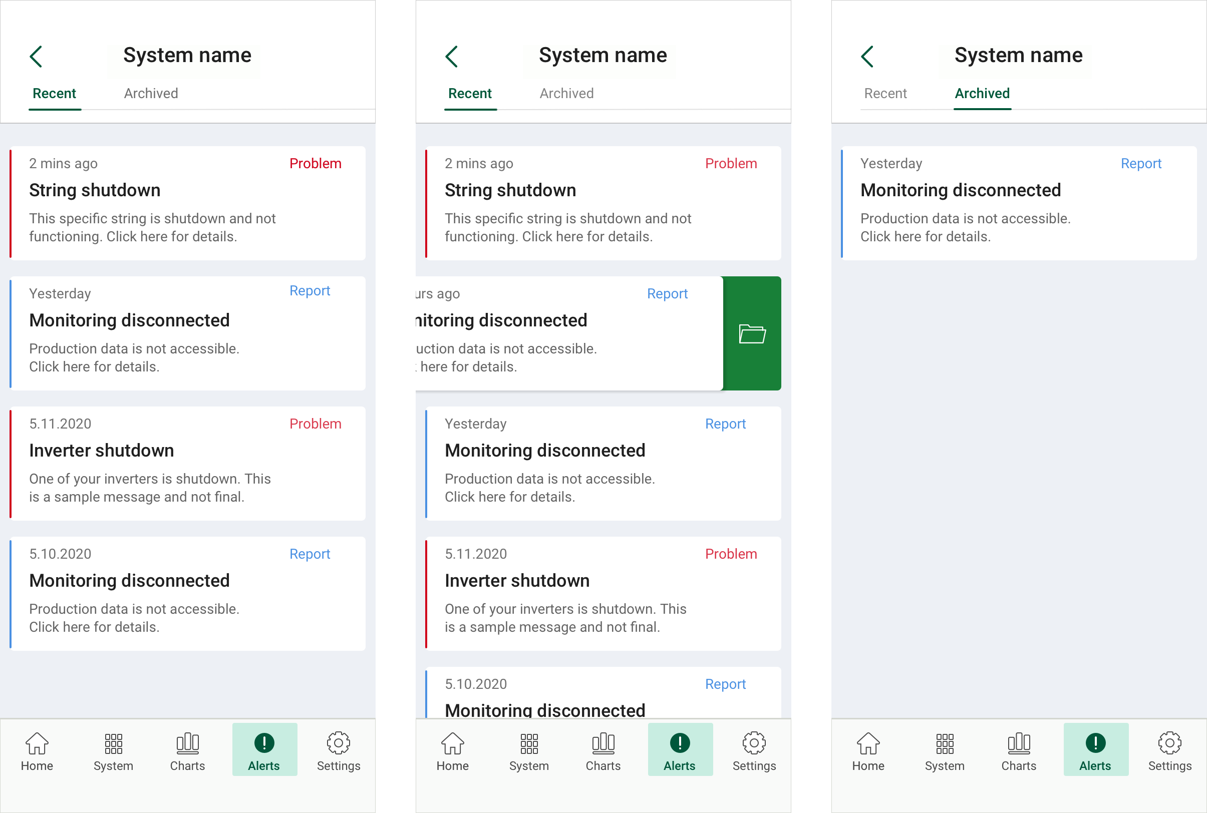
The old mobile app had no way to view alerts. I added system-level alerts so users could review issues within the app.
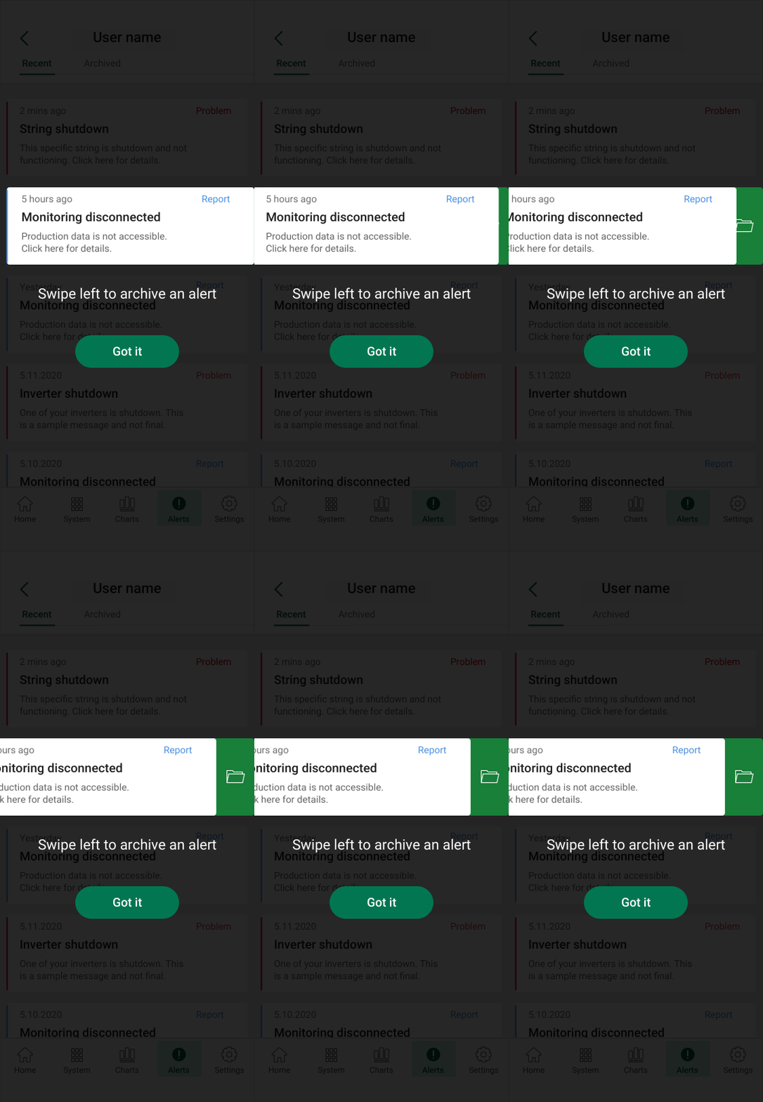
Swiping left on an alert card revealed the option to archive it, keeping alert management within the mobile workflow.
Support the people responsible for more than one installation.
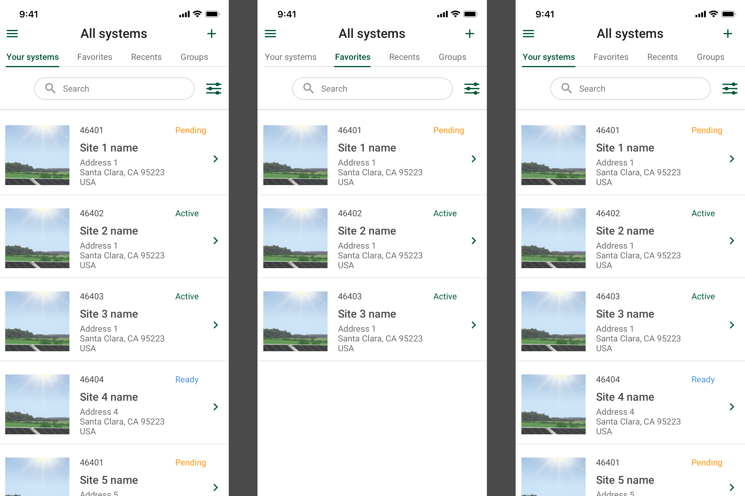
Many users were installers or businesses managing multiple solar systems. A single list did not provide a way to organize that portfolio.
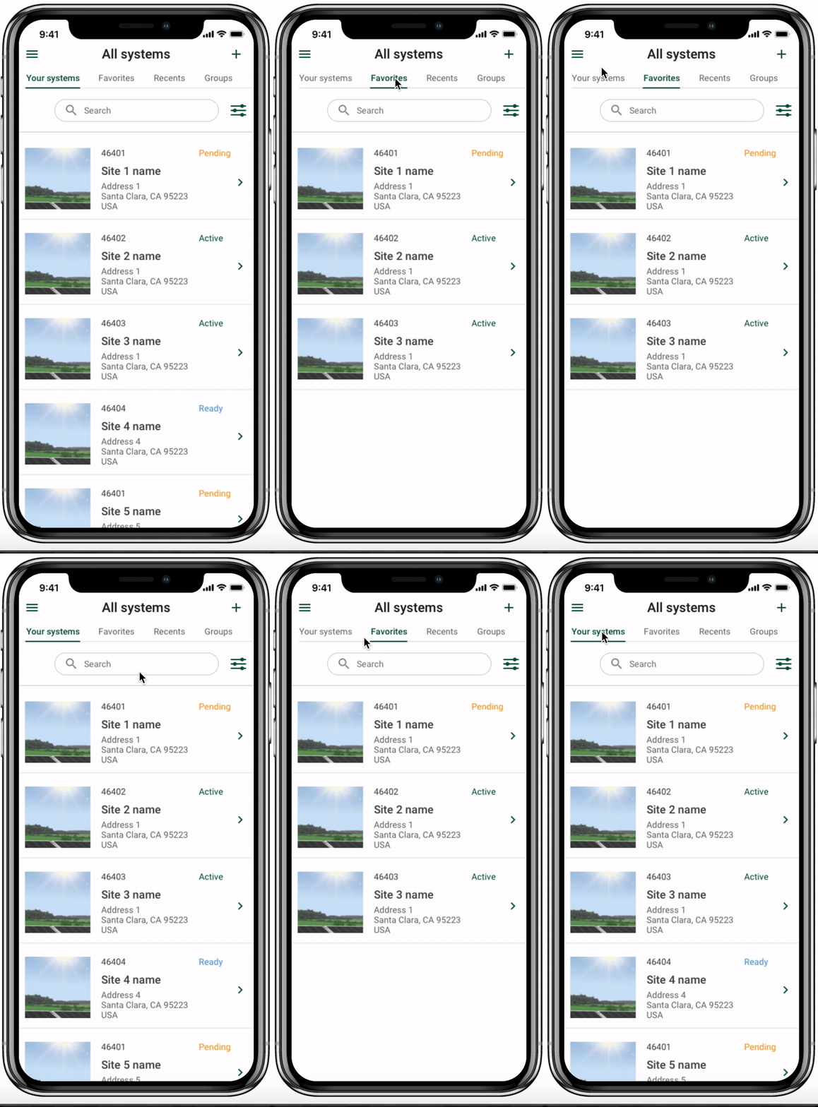
I added groups so users could categorize their systems. The system browser also provided access to favorites and recent systems, alongside search.
A beta redesign with a defined feedback plan.
At the time of the original 2020 case study, the redesign had entered beta, with most of the work implemented in a sandbox. A limited rollout was planned to gather feedback.
Premium signups and user feedback were identified as success measures. The original case study did not include post-launch results.
What stayed outside this release
Interactive weather and electric-vehicle charging status were future concepts, outside the scope of this update.
What I took forward
Mobile monitoring needed to support both a quick performance check and the work of managing several installations. Charts, alerts, and groups addressed different parts of that job while keeping the data understandable for users with varied technical backgrounds.