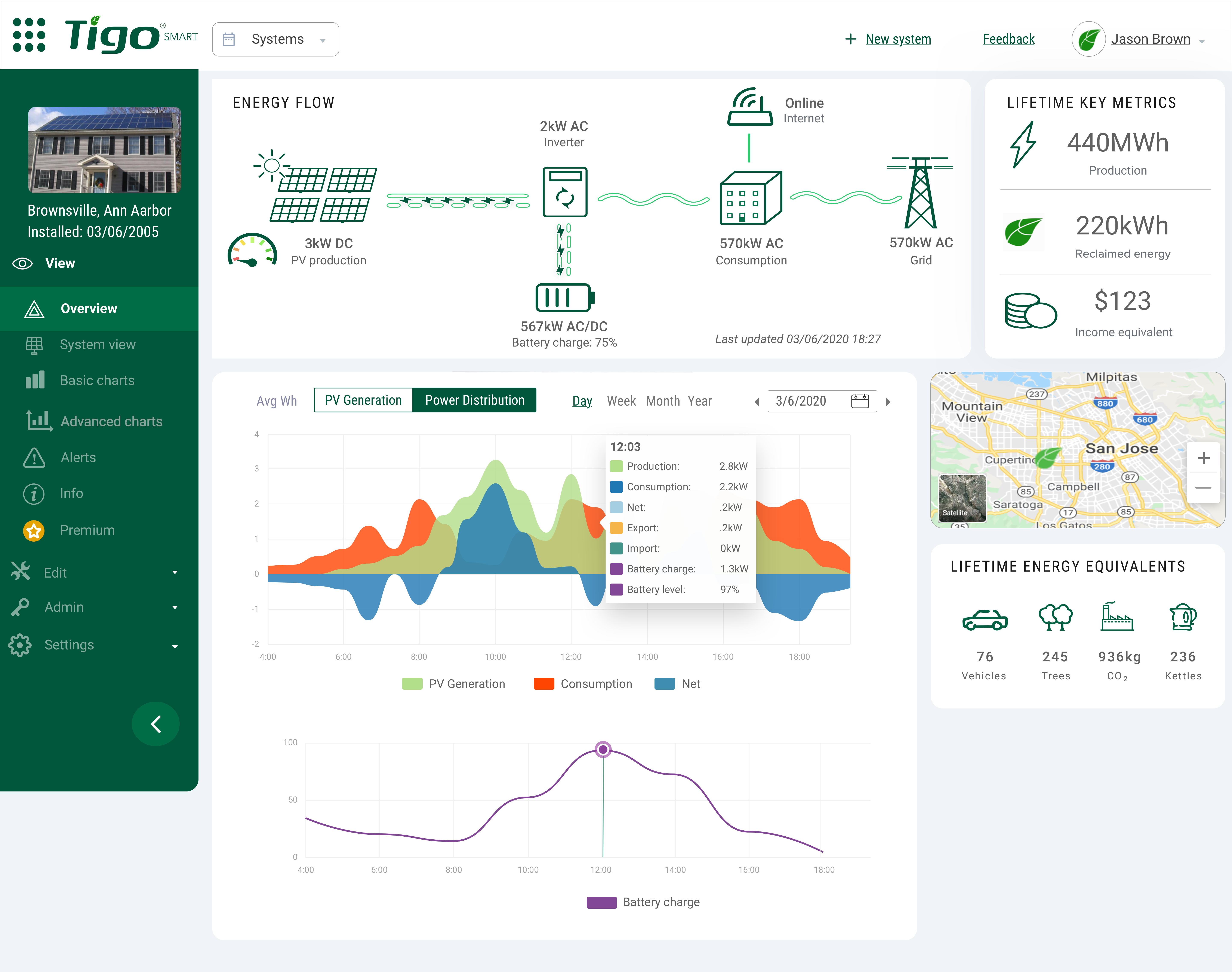
A high-stakes partnership. A dashboard that needed to catch up.
Taigo Energy’s monitoring app helped people track solar-system performance, with advanced features available through a premium subscription. A multi-million-dollar inverter-manufacturer partnership was on the line, and the dashboard needed a fast redesign.
As the sole UX designer, I worked with Product, Engineering, Marketing, and Support to refresh the interface and improve the monitoring experience.
Analytics showed that roughly half of users left after viewing only the overview dashboard. The existing layout gave substantial space to the map and weather, while system performance was harder to interpret.
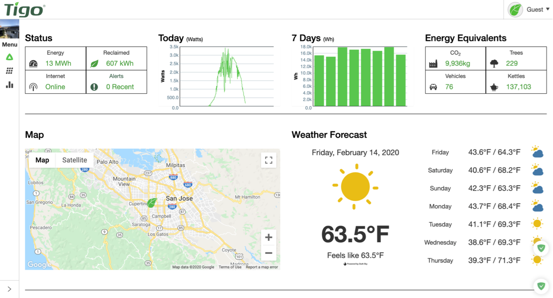
Design for owners and installers, without assuming electrical expertise.
System owners wanted to understand their generation and the return on their solar investment. Installers needed to check performance and troubleshoot individual modules.
Conversations with Product and Support challenged my assumption that installers would be comfortable with technical terminology. Support regularly heard from people with varied levels of electrical knowledge.
New inverter partnerships also made AC data available alongside panel-level DC data. Owners cared about the power their homes actually used; panel-level information remained useful for investigating low performance.
Make the movement of energy visible.
Competitive research, user feedback, and stakeholder discussions helped prioritize two core features: a system-level energy-flow view and a graph comparing generation, consumption, and grid exchange.
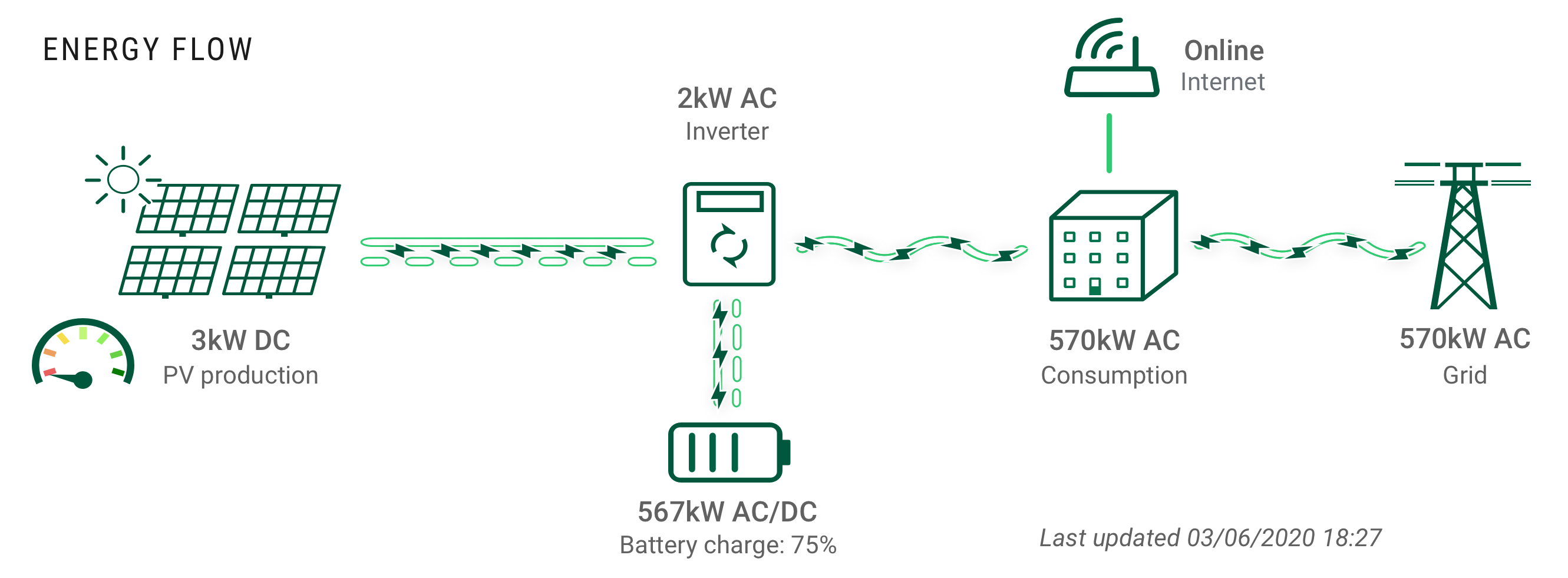
Where is the power going?
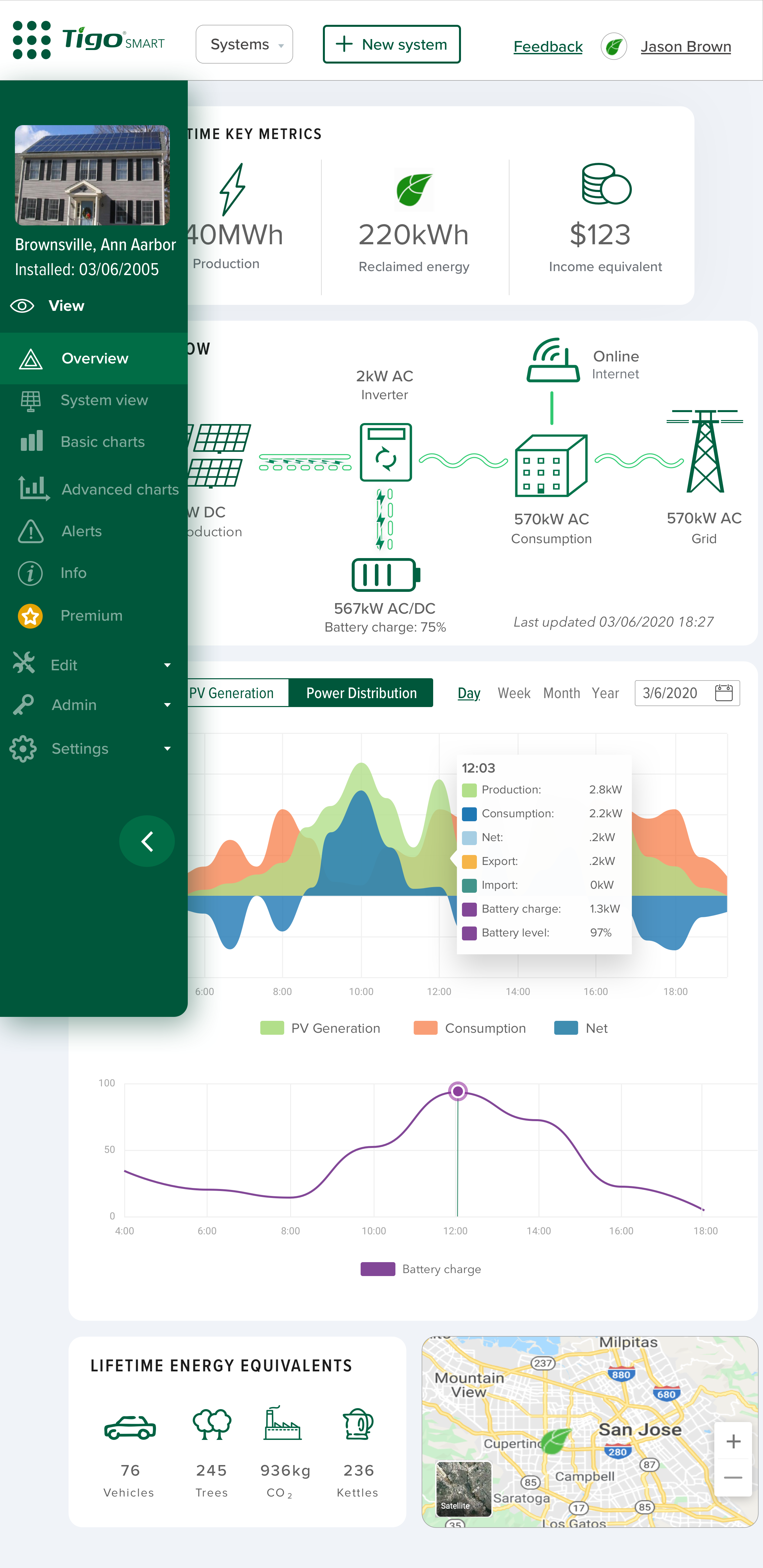
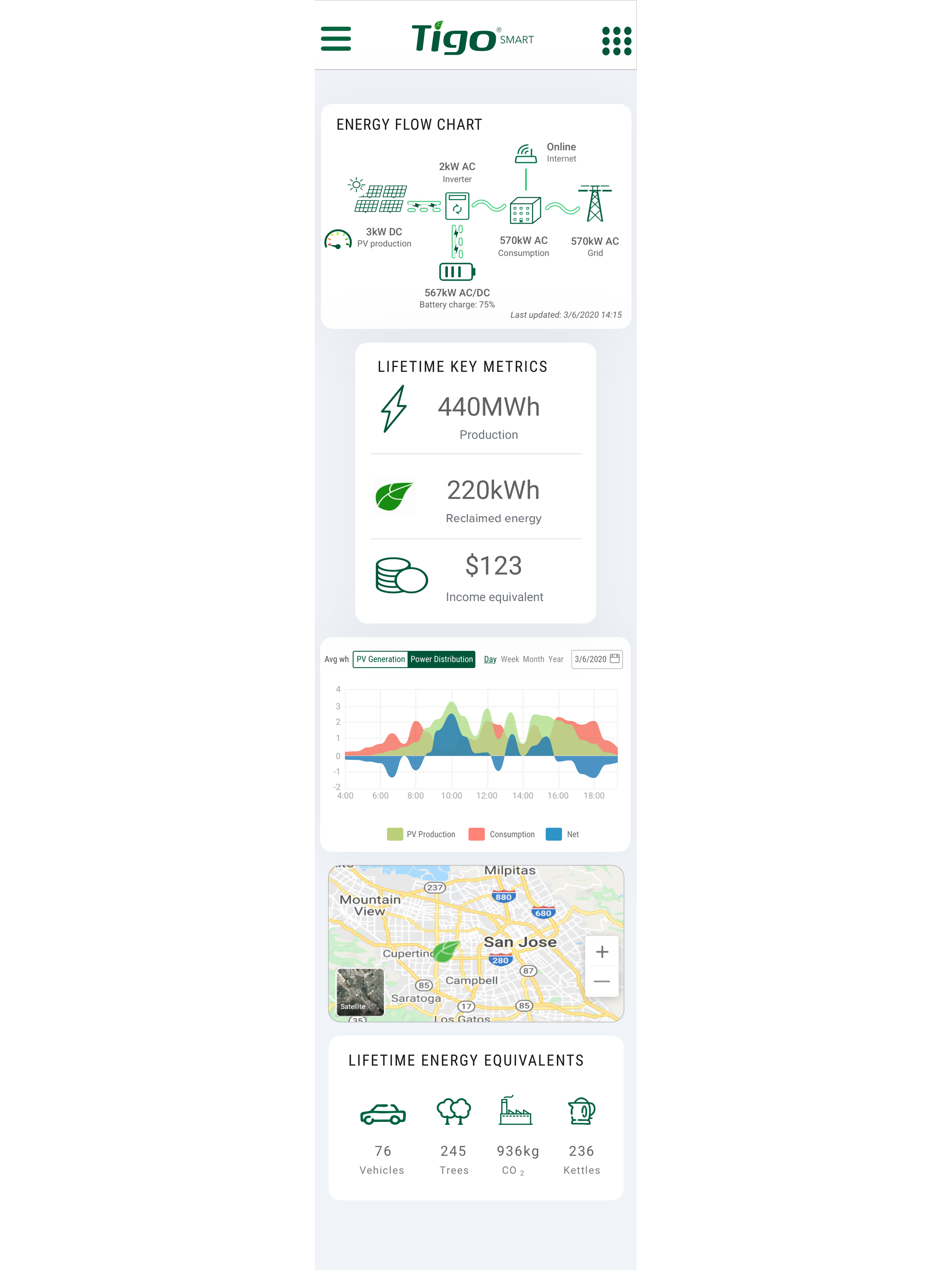
The energy-flow widget connected solar panels, the inverter, battery, home, and grid in one view. Direction and status information helped users understand the system and identify where to investigate an issue.
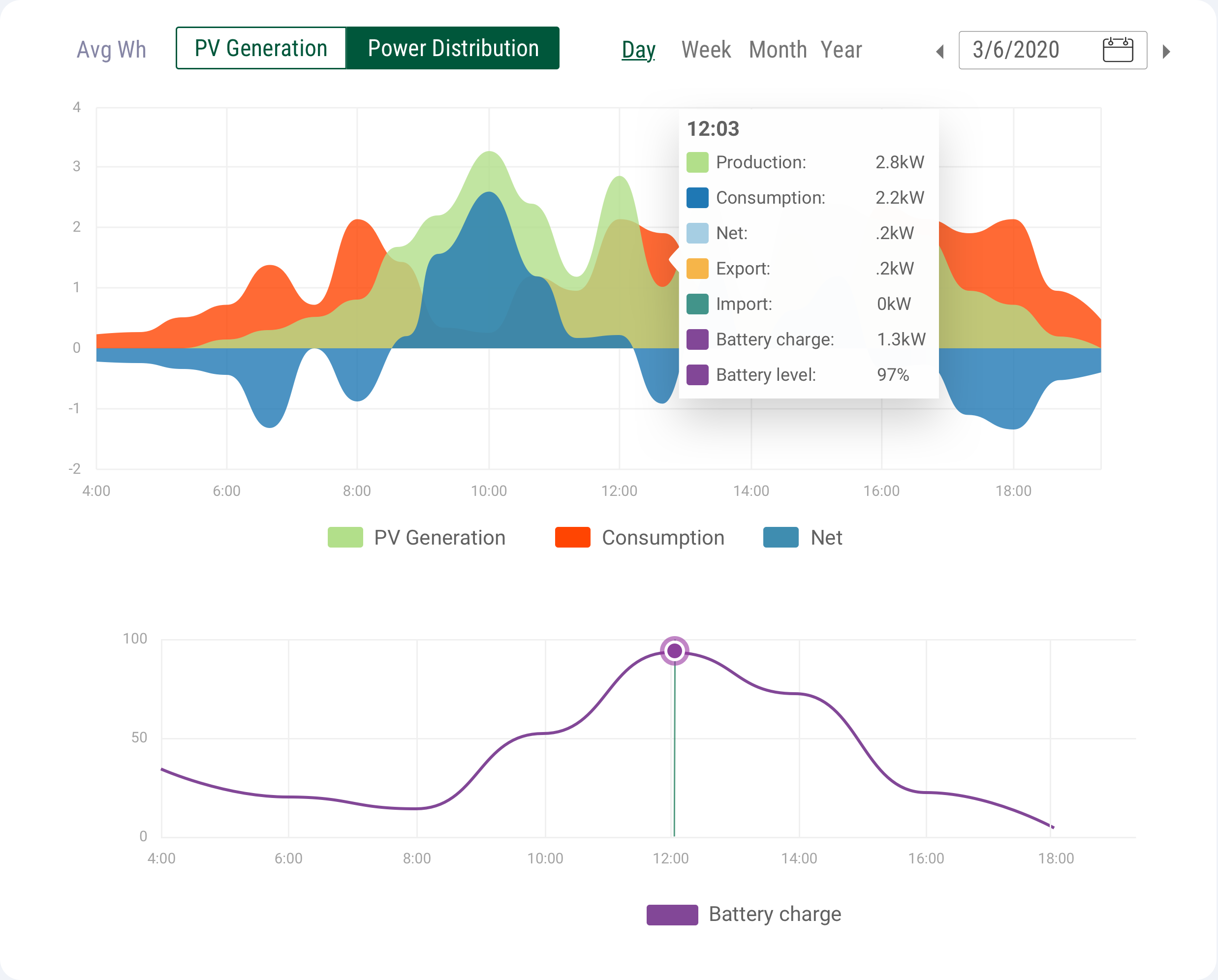
How is the system performing over time?
The generation graph brought production, consumption, and net grid energy together. Battery state of charge added context for understanding how stored energy contributed to the system.
Give the data a clearer visual structure.
I aligned stakeholders around a refreshed theme, using concepts and a mood board to make the direction concrete. Neutral backgrounds and distinct widget boundaries separated information that previously competed on one surface.
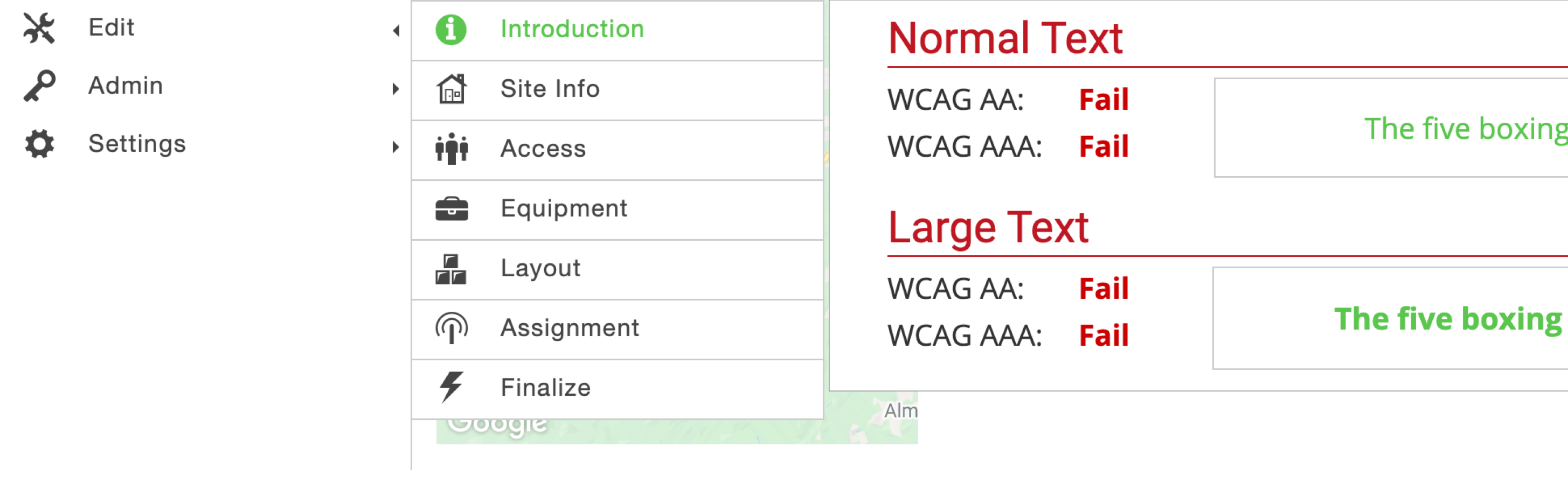
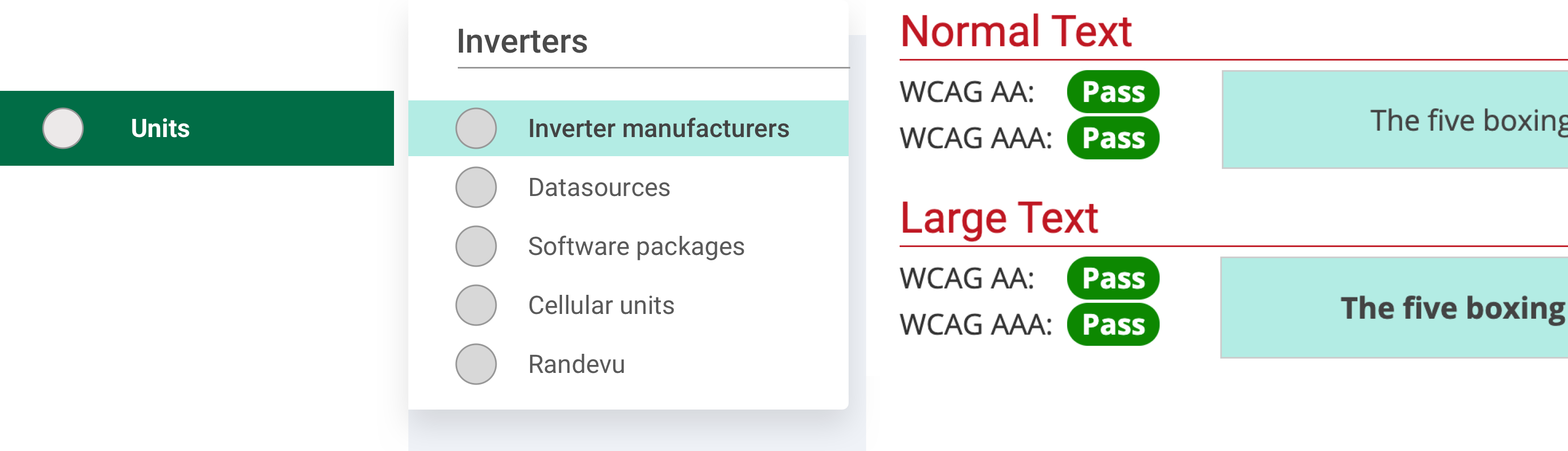
A darker green supported stronger contrast on white and more flexible use across navigation and controls than the brighter brand green.
A shared grid from desktop to mobile.
Engineering was implementing with Bootstrap while transitioning toward Vue. At their request, I designed all breakpoints on a 12-column grid to make the layouts easier to translate into the product.
I worked with the team on tickets and backlog grooming as the redesign moved into implementation.
The redesign reached beta.
At the time of the original 2020 case study, most of the redesign was implemented in a sandbox and had entered beta. A limited rollout was planned to gather user feedback.
Premium signups and user feedback were identified as success measures. Post-launch results were not included in the original case study.
What I took forward
A technical product still needs to explain itself. Understanding the different questions owners and installers brought to the dashboard helped me prioritize useful information and make complex system behavior easier to follow.