Bringing service discovery and purchase into search
When Amazon moved Add-to-Cart into search, customers could skip the product detail page. That made checkout faster, but it also meant they could miss the installation, haul-away, and delivery services offered there.
I led service discovery across search, product pages, and checkout for Heavy Bulky Services, coordinating with the teams responsible for each surface. I brought service discovery and the ability to add services into search, where customers were increasingly making their purchase decisions.
The category represented approximately $25B in annual product revenue and $200M in annual services revenue.
Customers could skip services entirely
The 2024 platform initiative put Add-to-Cart directly in search results. That reduced navigation, but customers could now buy a television or appliance without visiting the product detail page where those services were offered.
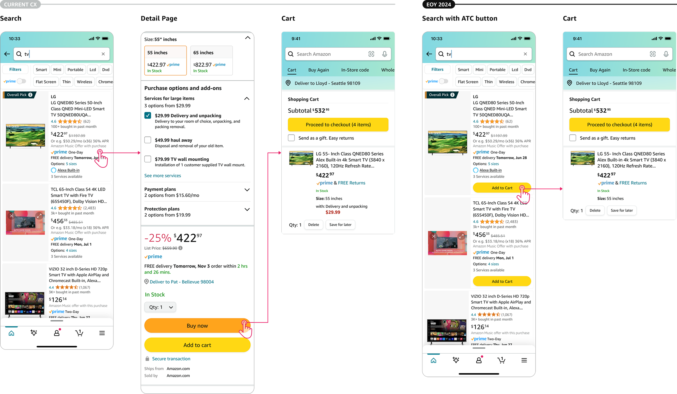
Some services could still appear in checkout, but that surface prioritized completion. It was a weak place to discover or understand an unfamiliar offering.
“I didn’t know Amazon offered services like installation.”
Recurring customer interview feedback
Research showed that service awareness was already low. Customers could spend up to two weeks comparing large purchases and often needed related products and services together. Removing another discovery moment increased the risk.
Move discovery with the decision
Make services visible in search, while preserving the faster purchase path.
I explored patterns that made services easier to find and understand across categories. The design had to account for search visibility, limited space, and checkout’s focus on speed.
Discoverability
Surface services early in the purchase journey.
Clarity
Distinguish operational services from physical products.
Scalability
Use patterns that work beyond heavy bulky purchases.
How much prominence was enough?
Each direction traded a different amount of visual weight and implementation effort for service visibility.
Exploration 01
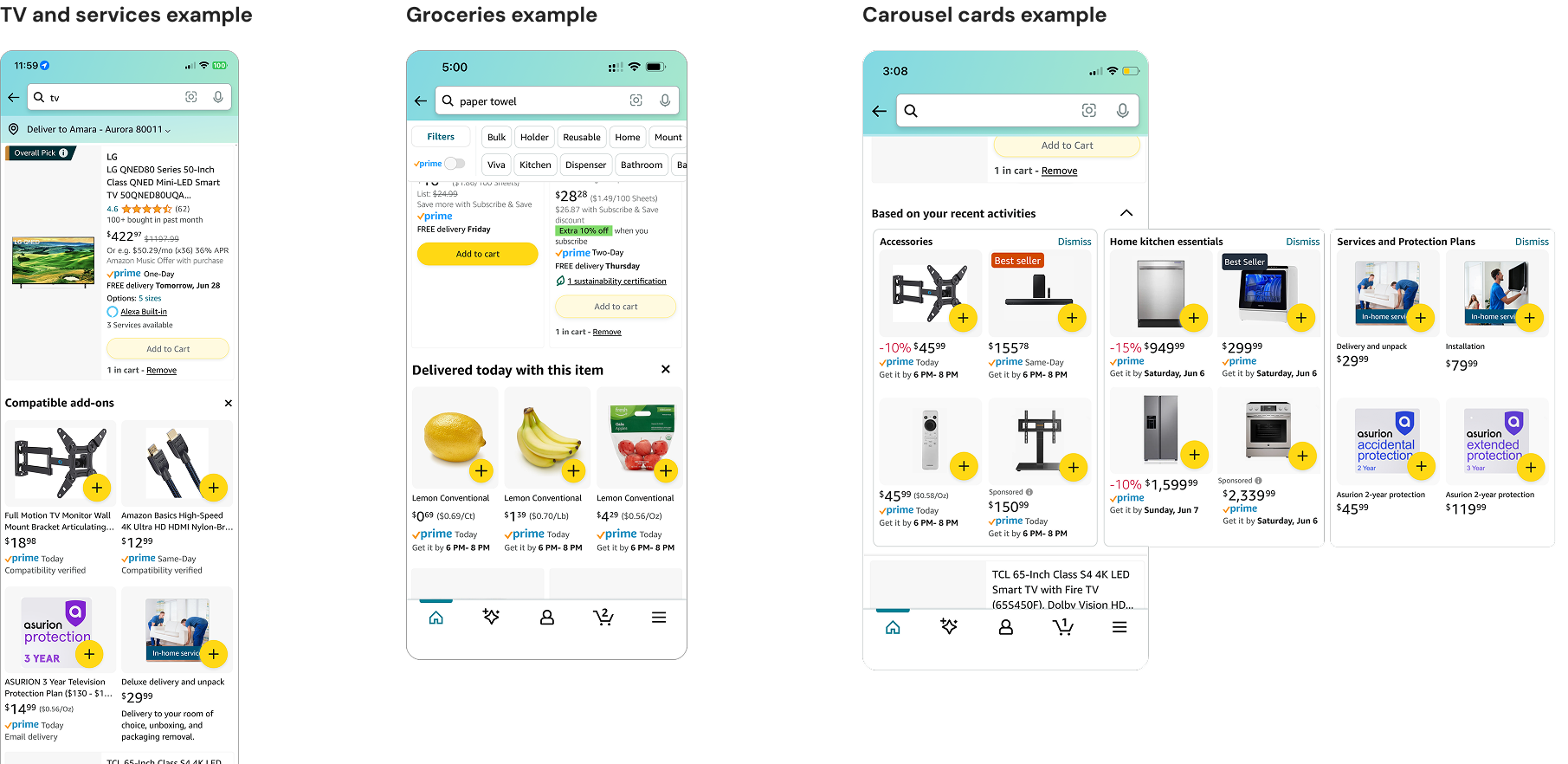
Reuse lightweight add-on surfaces
Expandable sections and carousels reused existing patterns and limited engineering effort. But placing services alongside accessories made them feel like optional extras. Large purchases needed more context.
Exploration 02
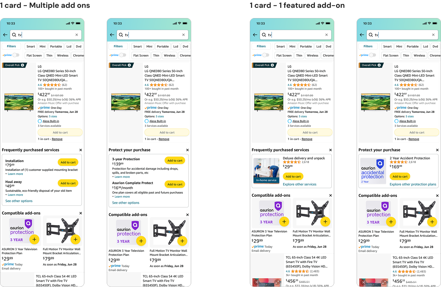
Separate services from accessories
Dedicated service modules clarified the difference between installation or delivery and physical add-ons. The trade-off was space: expanded modules occupied more of the results page, and some users read them as upselling.
Exploration 03
Make services an entry point
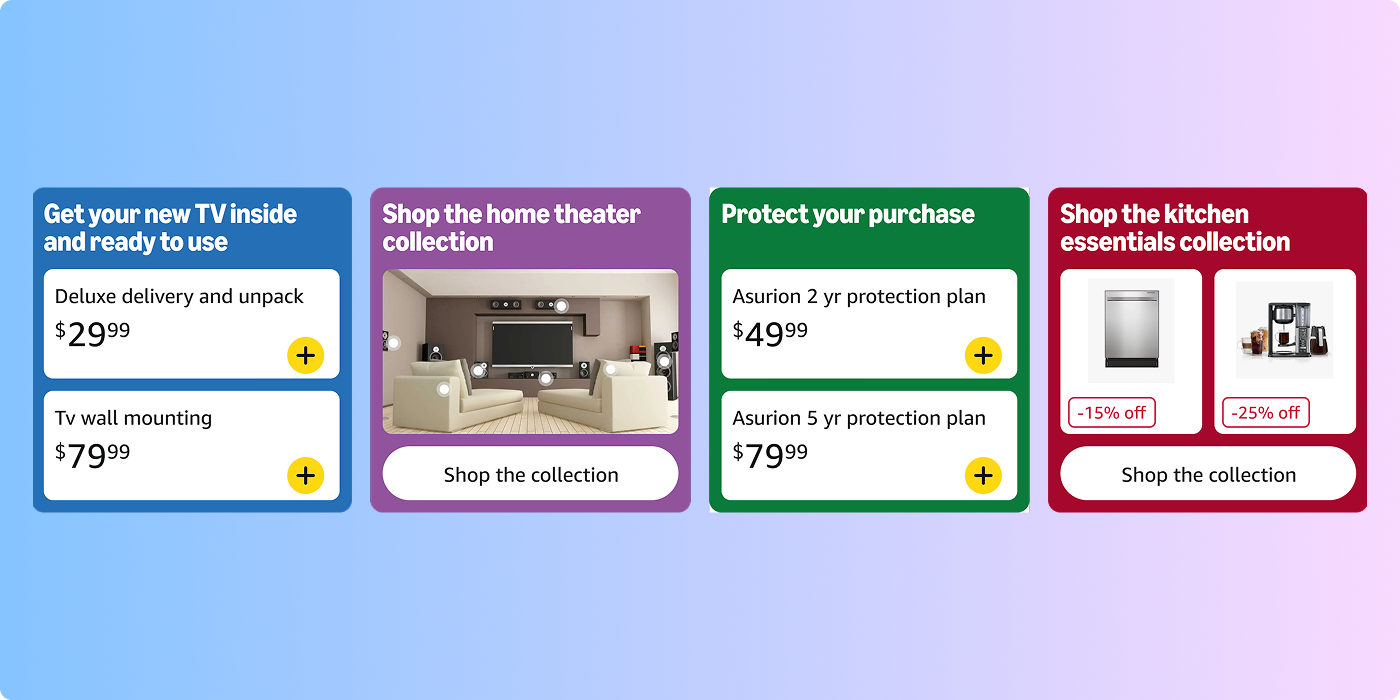
Colored cards stood out against Amazon’s mostly white search interface. Framing them around goals such as home theater setup or appliance installation made services a starting point for a complete purchase.
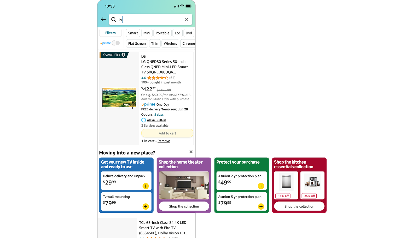
This direction better matched how customers planned purchases involving multiple components.

Show what the service includes
Installation, assembly, and haul-away involve details that are difficult to communicate through bullet points. I explored short video demonstrations within service cards so customers could see how the service worked.
Watch on YouTube ↗︎Increased service attach rate and engagement
Customers could now add services directly from search, something they could not do before. After launch, service attach rate increased.
We also observed higher engagement with service modules, more interaction from search-based shoppers, improved service visibility earlier in the journey, and increased service glance views.
Exact metrics are confidential.
What I took forward
A platform change can improve one part of a journey while weakening another. Keeping services discoverable meant considering search, product pages, and checkout together, then balancing visibility with purchase speed.
The work reinforced the role of visual hierarchy and explanation in helping customers understand complex services.
Read the full story on Substack ↗︎